The FEM app is designed to assist busy parents and small business owners in managing the fuel expenses of their drivers.
For the final project in Ironhack UX/UI bootcamp, we were able to choose the problem that we wanted to work on. During our discussions, we carefully considered various problems that our team could focus on. Eventually, we chose to address a challenge faced by one of our team members, which is: How might we ensure the transparency and safety of fuel expenses for busy parents and small business owners who employ drivers?
We started by researching more about the problem to be able to build solid survey and interview questions. As a first step, we prepared a survey using Google Form and published it. We wanted to understand what problems users face and what methods they have used to manage their fuel expenses.
Based on survey insights, we were able to conduct 5 interviews. We wanted to dive deeper into user problems, and these are some user quotes:
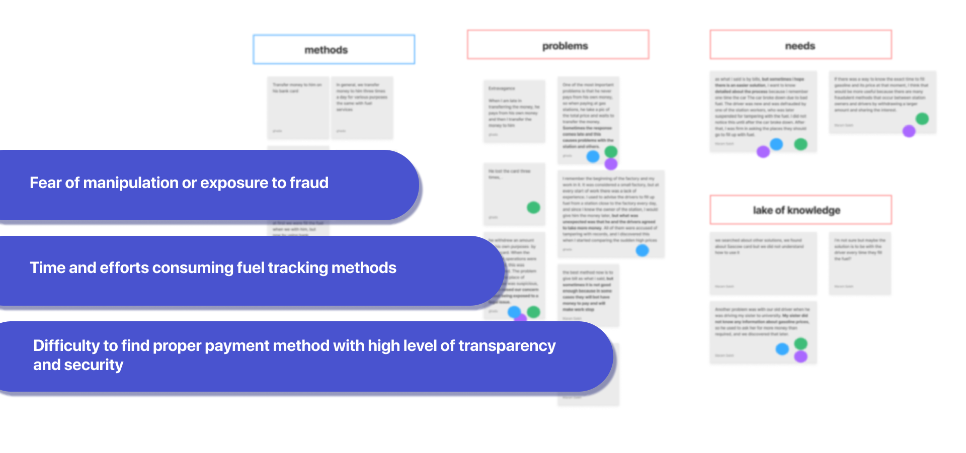
We used the affinity diagram to highlight the most important points and then cluster them under four main categories: By doing that, we were able to determine the pain points. Users expressed that they have a fear of fuel expenses manipulation, and some of them were already victims to that. They also expressed how hard it is to track fuel expenses because of many reasons, such as using different methods to give money to drivers, having more than one driver, or being so busy.
And yes! Let’s introduce Sarah and Ahmed. Sarah is a working mother who employs a driver for her and her child's needs. She is very careful when it comes to family expenses, so she wants to manage and control everything properly, including driver fuel expenses.
Ahmed is a small food store owner. He employs drivers to deliver orders. He faces a problem tracking and managing fuel expenses, so he wants a simple way to manage fuel expenses.
Sarah went through many stages before she identified a problem, starting with her need to employ a driver. She decided to give him cash every morning to pay for fuel, but after some time the driver was asking for more money, and because she did not have any clue about fuel prices, she thought it was normal until she discovered it was not. She discovered he was lying and using money for personal purposes.
Ahmed was managing fuel expenses by asking drivers to give him fuel bills at the end of the work day, but this was not efficient because drivers needed to pay with their own money; they sometimes did not have enough money to pay, which made the food delivery process stop. He was also tired of checking bills and paying for the drivers every day.
In the ideation stage, we introduced 3 HMW questions to generate suggestions, we used the 8'z crazy method, we used the MOSCOW method to prioritize the ideas, and we determined the final MVP: App provides digital fuel card linked to vehicle and driver information with limits on expenses, and detailed transaction records and reports for fuel management.
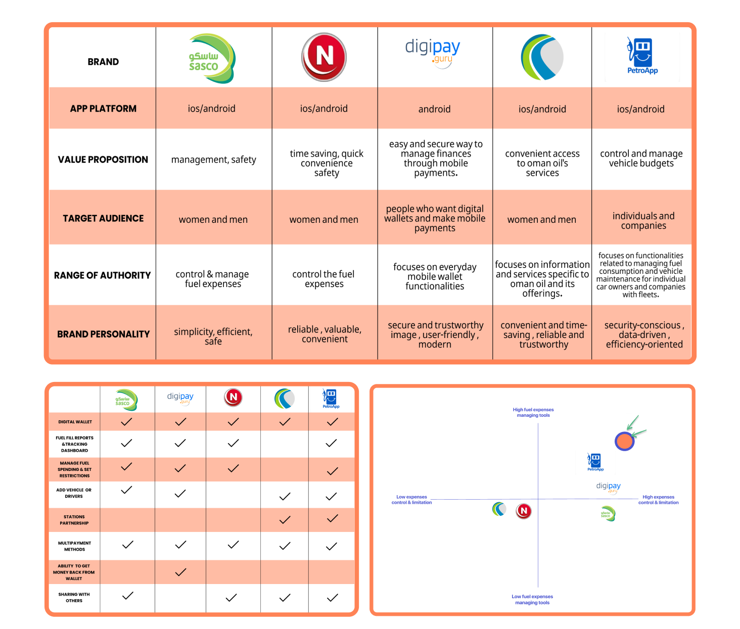
We conducted competitive analysis to help us understand how users experience competitor products. This lets us find strengths and weaknesses to improve our solution. We did three main analyses: brand analysis, feature analysis, and mapping competitors.
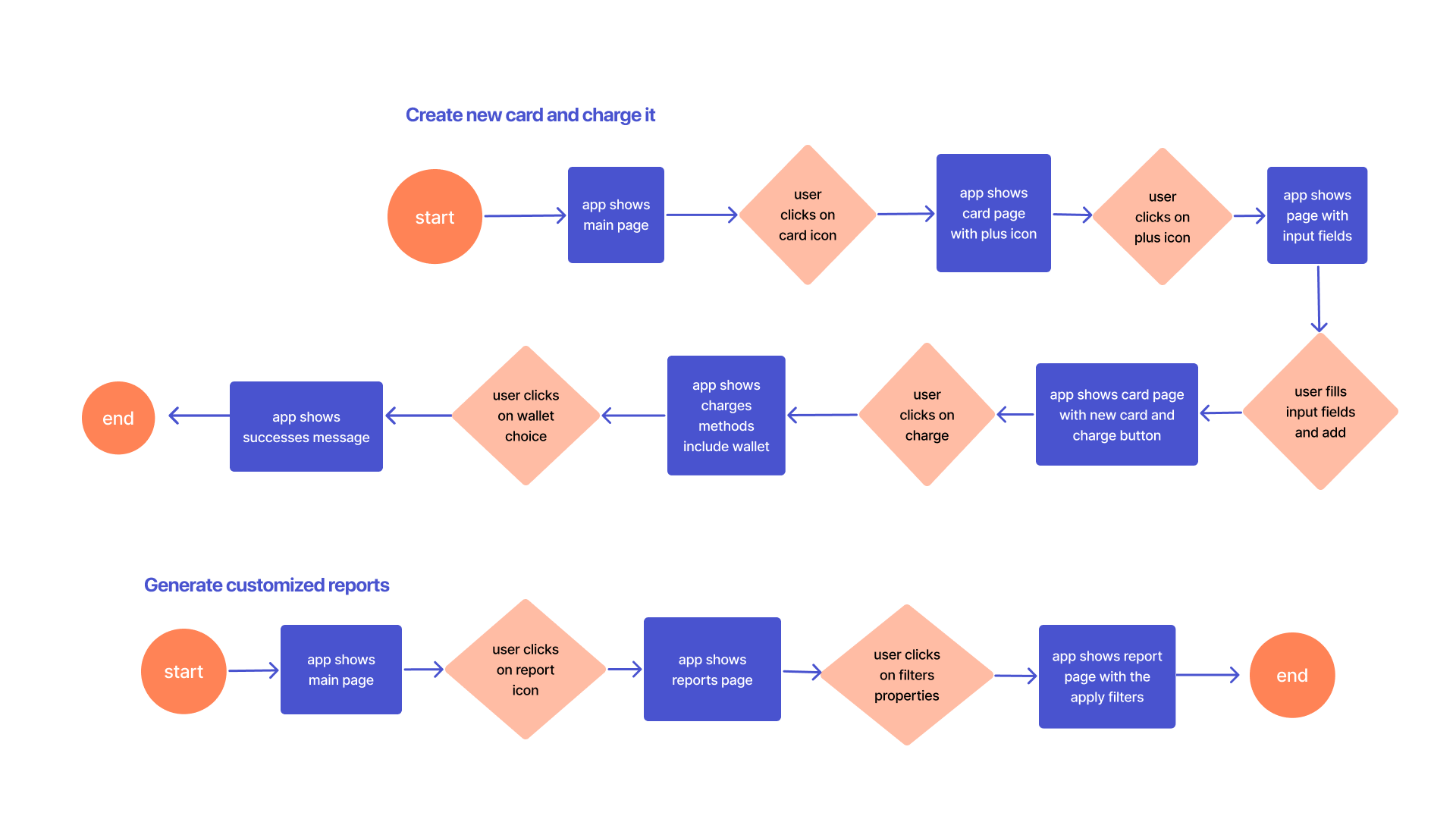
We know what we want to solve, so to have a clear idea of how users will navigate through the app, we created multiple user flows. Here are the most important ones.
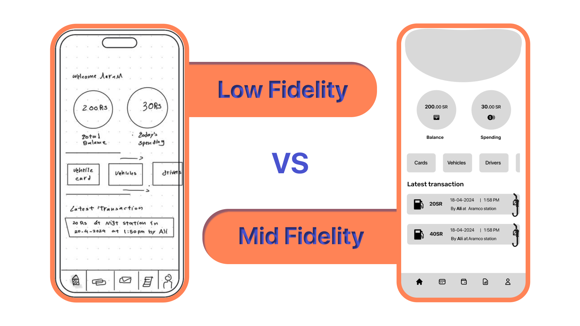
After determining the user flow, we begin by sketching our ideas as low-fi designs and prototyping them. We conducted user testing with five users, and the process helped us enhance ideas. After that, we designed the mid-fi one and conducted usability testing with 6 users to ensure and test the app's functionality.
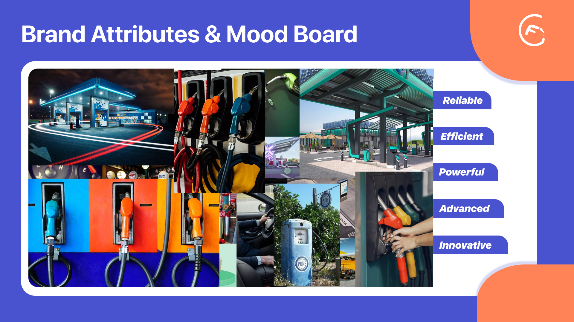
As first step, We defined the brand attributes for the app. These brand attributes captured the desired characteristics and personality of the app, and based on that we created the moodboard.
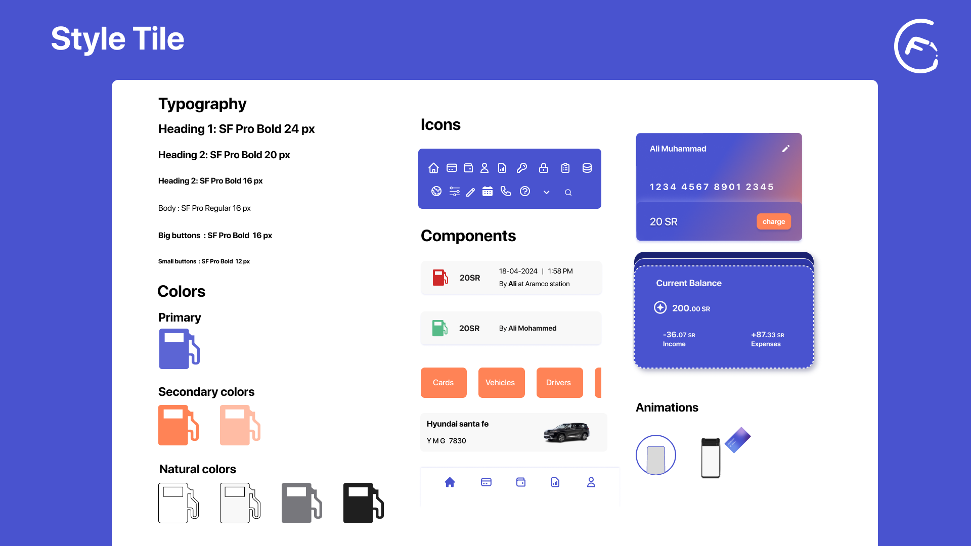
For the style tile, we wanted to design for IOS, so we started to study and search about IOS principles. we chose SF Pro font, and we determined background color, container color, label color, margin and so on, depending on IOS principles. After that, we chose the main colors of the app based on brand attributes.
The FEM app provides two main interfaces, one for the driver and one for the owner. So i will assume that Sarah is using it. At first, Sarah needs to sign in using a Facebook, Google, or Apple account, or simply by her email and password.
Sarah signed in successfully. From the main page, Sarah can see her wallet balance, spending, and latest transaction. She can navigate easily to the important sections on the same page. She can also see transaction details when clicking on it, including driver name, station, expenses, and fuel price at the moment of fill because, as far as we know, the fuel price differs from day to day
But how do these transactions appear? To manage fuel expenses, Sarah needs to create a card for her driver. To create a new card, she needs to fill in the required information, such as the driver information, the vehicle information, and card limitations if needed. A card can be created for an existing driver or a new driver, and when Sarah chooses an existing driver, the app immediately prevents her from adding a new one. The card limitations feature helps Sarah manage her daily, weekly, or monthly spending balance. To view and modify card information, Sarah can click on the edit icon, make changes easily, or even stop the card.
The card has been successfully added. To charge the card, we have provided several options. The fastest and best method is to use the digital wallet within the application, which can be found in the main navigation menu and charged through other methods as well. However, if Sarah is in a hurry, busy, and has no balance in the wallet, she can directly charge the card using different payment methods.
To see reports and statistics, Sarah can directly navigate to the reports section, where she can see a detailed chart of drivers and their expenses. If Sarah wants to see expenses for a long period of time, such as monthly or annual, the application will automatically collect the expenses of each driver in one place, and in case she wants to know more about a transaction, she can click on details.
Going back to what we mentioned earlier, the application has two different interfaces for different users: the owner and the driver. When Sarah finishes creating the card, she will ask her driver to download the application, choose the driver interface, and then enter the card details. The application will send a verification message to Sarah to allow the driver to use the card. After that, the driver will be able to use the card at fuel stations.
In fuel stations and by using the Android POS machine or terminal machine, we designed the FEM station app, which will help to use cards in a more efficient way because it will prevent using cards for different cars or in different places by ensuring the card is related to the vehicle and driver.
In addition to usability and accessibility testing, We also conducted desirability testing for the app. We created a survey that included six screenshots of the app's interface. The survey aimed to assess users' perceptions of the app's aesthetics, visual appeal, and overall desirability. Users provided feedback that highlighted several positive attributes of the app, including its efficient, useful, advanced, and creative.